Tuesday, April 16, 2013

Box Plot


A box plot displays the distribution of data through five characteristics of the data set: smallest observation, lower quartile, median, upper quartile, and largest observation.

Triangular Plot


A triangle plot is a graphic representation used to show how three variables sum up to a whole. This example of a triangle plot shows ways tsunami waves from three modeled sources can arrive at a coastal site. 

Star Plot


A star blot is a graphic tool used for displaying multivariate data, with each point of the star representing a single observation.  This star plot of the success of different MER IDD designs with respect to 7 different parameters. 

Stem and Leaf Plot


A stem and leaf plot is a visual display of numerical data that makes it easy to find the mean, median, and mode. The first digits of the number are placed on the left side, and the last digit of the number are placed on the right side. 

Histogram


A histogram is a graph where the height of each bar is proportional to the frequency density of the interval. This is a histogram that shows scores on an exam and the number of students who received that score.  

Windrose


A windrose is a graphic used to display both wind speed and direction for a particular location. This is a windrose from LaGuardia airport in New York, New York.

Climograph


A climograph is a graph that displays the basic climatic parameters for a given location, such as average temperature and precipitation. This is an example of a climograph because it displays the average monthly precipitation and temperature for Calcutta.

Monday, April 15, 2013

Population Profile


A population profile is a graph that shows the structure of a population by the amount of people that are in each age group.  This is a population profile of Northern Ireland. 

Scatterplot


A scatterplot plots individual data points to determine a possible relationship between two variables. This is a scatterplot of diamond size vs diamond pricing, and this scatterplot shows a positive correlation. 

Index Value Plot


An index value plot is a line graph that uses normalized averages instead of original, raw numbers. This is an index value plot of average stream flow in North Carolina.

Accumulative line graph or Lorenz curve


A Lorenz curve is a graph on which a cumulative percentage of a variable is plotted against the cumulative corresponding population.  This image is a Lorenz curve of national income. 

Bilateral Graph


A bilateral graph is a graph that displays two different sets of data on the same graph.  This is a FDIC graph of percent of assets, and it is bilateral because it displays both longer term mortgage assets and construction and development loans. 

Nominal Area Choropleth Map


Nominal area choropleth maps display nominal or qualitative data instead of numerical/quantitative data.  This is a map of the different ethnic groups in Kenya.

Unstandardized Choropleth Map


A unstandardized choropleth map displays raw, original data that hasn't been averaged. This map is the same as the unstandardized choropleth map, but the it is the original data and the data hasn't been averaged and standardized to per square mile. 

Standardized Choropleth Map


A standardized choropleth map display averaged data that is standardized to some unit, such as area.  For example. the map above displays population density, which is the amount of people standardized to an amount of area.

Univariate Choropleth Map


A univariate choropleth map is a choropleth map that is only showing one cartographic variable. This map is showing the percent of people who are Hispanic or Latino in Florida by county. It is a univariate choropleth map because is there is only one target variable that is being mapped. 

Bivariate Choropleth Map


A bivariate choropleth map is able to map two cartographic variables on the same map.  This is a map of the US and it is a bivariate choropleth map because it is displaying both the population density in 1990 as well as the percent change from 1990 to 2000. 

Unclassed Choropleth Map


Unclassed choropleth maps are similar to cholopleth maps, except that the color/shading for each area is not assigned based on an averaged statistic, is it a continuously shaded range of values. This is the same map of divorce rates in the US in 1990, except a unclassed choropleth legend is used. 

Classed Choropleth Map


In a classed choropleth map, aerial units are grouped into categories based on their value for the target variable. All the units within each classes are shaded the same color. This is a map of the divorce rates in the US in 1990. Each area that has a specific divorce rate is given the same color.

Range graded proportional circle map


A range-graded proportional circle map compiles all the values into groups with a specific range, then uses a proportional circle map to depict the occurrence and location of each range of values. This is a map of motor vehicle deaths in California.  It is a range-graded proportional circle map because the number of deaths are are sorted into 5 groups, each with a range of values, and each with a circle that has a corresponding proportional size. 

Continuously Variable Proportional Circle Map


A continuously variable proportional circle map is like a proportional circle map, except the values are continuous, so the map can have almost countless sizes of circles on it. This map is a continuously variable proportional circle map because it uses the different sized of circles to show how much and the different proportions of meat that were sent to Paris from different regions in France. 

DOQQ


DOQQs (Digital Orthophoto Quarter Quad) are digital aerial images taken by the USGS.  The images have been corrected for displacements and have a resolution of 1 meter. This image is a DOQQ from Texas of the Texas Longhorn's stadium.

DEM


A DEM (Digital Elevation Model) uses GIS software to produce a 3D representation of an area's surface. This is a DEM map of the Lake Tahoe basin.  It is a DEM because GIS data was used to create  a digital model for the shape of the basin. 

DLG Map


A DLG (Digital Line Graph) is a digital vector cartographic feature that comes from the USGS.  This is a map of the Tosohatchee Wildlife Management Area with the USGS DLG data incorporated into it. The DLG data mapped includes streams, rivers, lakes, wetlands, roads, railroads, power lines, buildings and other geographic and man-made features.

DRG map


A DRG (Digital Raster Graphic) is a USGS topographic map that has been scanned into a computer.  This is a DRG of an area around the Potomac River in Washington DC.  It is a DRG because it was a printed topographic map that was then scanned.

Isopleth Map


An isopleth is a line that connects areas that have the same value for a given variable.  This is a map of nitrate ion concentrations in the US.  It is an isopleth map because the lines that are shaded in connect areas that have the same nitrate ion concentration. 

Isopachs


Isopachs are lines on a map that connect areas of equal thickness, usually of a geologic unit or strata.  This is a map of Ohio, New York, and Pennsylvania with isopachs of the Tully Limestone and Moscow Shale (blue lines).  

Isohyets


Isohyets are lines on a map connecting areas that received the same amount of rainfall. This is a map of part of New Zealand with isohyets showing how much rain the area received in 2008.

Isotachs


Isotachs are lines on a map that connect areas that have the same wind speed. This is a map of the US on October 28th with isotachs on it. 

Isobars


Isobars are lines on a map that connect points that all have equal atmospheric pressure. They are often used in meteorology to show and help predict weather patterns.  This map displays isobars because each of the connected lines around the low pressure system show an area that has the same pressure.

LIDAR


LIDAR, which can stand for Light Detection and Ranging or Laser Imaging Detection and Ranging, is a type of remote sensing technology that can be used to measure the distance to or other properties of a specific area by hitting the area with laser light and measuring the feedback. This image is a LIDAR map of Blue Ridge. This is considered a LIDAR image because it was derived from a raw data LIDAR point cloud, and a LIDAR-derived canopy surface model.

Friday, April 12, 2013

Doppler Radar


Doppler radar is a type of radar that is able to determine velocity data about object at a distance. It shoots a microwave signal at an object (like a storm) and measures how the signal comes back, and therefore can determine how the object's motion affected the signal. This is a picture of the doppler radar for Hurricane Frances from September 2004. 


Black and White Aerial Photo


Black-and-white aerial photography is used in both high and low altitude aerial photography because natural color film is often affected by atmospheric haze. This picture is a black-and-white aerial photograph taken of a strip mine.

Thursday, April 11, 2013

Infrared Aerial Photograph


Infrared aerial photography uses an image sensor that is sensitive to near infrared electromagnetic radiation. This is useful for taking images of vegetation and measuring health of forests as well as wetlands.  This is an infrared aerial photograph of the Sacramento deep water channel.

Cartographic Animation


Animated maps make use of computer generated animation to map the movement or other changing dimension of a mapped variable over time. Above is a cartographic animation of the Indonesian tsunami in 2004. It is an example of cartographic animation because the computerized animation of the movement of the wave is shown on a map of the area and shows the movement of the tsunami as time progresses. 

Wednesday, April 10, 2013

Statistical Map


A statistical map is a map that displays the statistical variation of a certain variable over a geographic area. This map shows the growth rates of the internet in Africa from July 1995-July 1996. This is a statistical map because it shows the percentage change in internet usage over the geographic area of Africa. 

Cartogram


A cartogram is a type of map in which a thematic variable is substituted for land distance/area when mapping an area.  This is a map of German counties, with the population of the districts being the thematic variable. This is an example of an area cartogram.

Flow Map


A flow map is a map that conveys the movement of objects or people from one geographic place to another.  This map is a flow map because it shows the movement of French wine exports in 1864. 

Isoline Map


An isoline map is a map that uses connected lines to represent areas of equal value for the information being displayed. This map is an example of an isoline map because this map is displaying isobars, meaning the blue lines are lines where pressure is the same.  

Proportional Circle Map


A proportional circle map is a map in which circles are used to depict values for each area. The area of each circle is proportional to the value of the factor being displayed. This is a map of sizes of the American Indian populations of states in the midwestern United States.  This is a proportional circle map because each circle for each state is sized proportionally to the size of the American Indian population for that state. 

Choropleth Map

http://www.geog.ucsb.edu/~jeff/gis/choropleth_maps.html

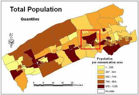
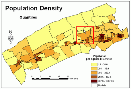
A choropleth map is a thematic map in which areas are shaded or patterned according to the measurement of the target factor being displayed on the map.  This map depicts crime rates, and it is an example of a choropleth map because the shade of color for each state indicated the amount of each type of crime that was committed there. 

Dot Distribution Map


A dot distribution map is a map that uses dots to represent the presence, quantity, or value of a phenomenon in an area. This dot distribution map indicates the spread of duckweed. This qualifies as a dot distribution map because each dot represents an occurrence of duckweed. 

Tuesday, April 9, 2013

Propaganda Map


A propaganda map is an attempt to persuade or influence the audience. They can be outright falsified or created with the intent of persuasion and therefore portray information non-subjectively.  This is a map from the Civil War trying to convey the message that General Winfield Scott's plan was to defeat the South economically and militarily. 

Hypsometric Map


A hypsometric map is a map that depicts topography while using colors to differentiate between contour lines or elevations. This is an aerial topographic map of the Iberian peninsula using hypsometric colors to depict elevation. 

PLSS Map

http://octane.nmt.edu/WaterQuality/maps/plss.aspx

A PLSS map uses the Public Land Survey System to divide up land parcels according to spacial delineations. This is a map of the township and ranges or Torrance county in New Mexico that uses PLSS.

Cadastral Map


A cadastral map provides detailed information about the location, dimensions, and ownership of an area of land. This is a cadastral map of the city of Pielnia in the Austrian Empire because it outlines each segment of property in the city and who owns it.

Thematic Map


A thematic map depicts the distribution of a pattern of a social or physical pattern with respect to a specific geographic area. This is a map of the soil moisture regimes of the contiguous United States.  It is a thematic map because it portrays the targeted theme (soil moisture regimes) over the set geographical area (the United States). 

Topographic Map


A topographic map is a map that represents a three dimensional area on a two dimensional surface by depicting elevation and relief, sometimes by using contour lines. This map is an example of a topographic map because it uses contour lines and shading to depict the elevation and natural features of this area. 

Planimetric Map


This map of bicycle parking spots on FSU's campus is an example of a planimetric maps. A planimetric map is defined as a map that shows only horizontal features without elevation. This qualifies as a planimetric map because it shows features like buildings and roads that can be seen aerially and it accurately portrays horizontal distances, but doesn't include topographic information such as elevation. 

Mental Map

http://www.geography.hunter.cuny.edu/~tbw/ncc/Notes/chapter.2.outline.html

This is an example of a mental map.  A mental map portrays a personal perception and interpretation of the world.  This map portrays the United States, in particular Michigan and the areas around it.  Michigan is larger and more prominent than the rest of the country because the creator of the map is from Michigan is therefore that area is of more importance and much more detail about that area is known.